Reproductive Health Services for Rural Guatemala
WINGS of Guatemala is an organization that provides reproductive health and education to the men, women, and youth of Guatemala — primarily underserved, rural populations. In a country where 94% of the population lives in rural areas and one in three women don’t have access to health and family planning services, WINGS has the opportunity to make a huge impact. Each year, the organization brings contraception and reproductive education to thousands of people across the country.
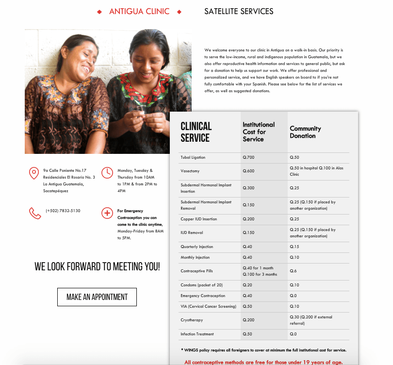
When WINGS first reached out to Hopsie, they had a huge collection of stunning, high-res photographs and videos, but their current website lacked a design and infrastructure that allowed them to showcase those images and really display the enormous impact of their work. A primary focus of our design team became creating a design that allowed us to maximize the beautiful imagery that WINGS had in their possession.
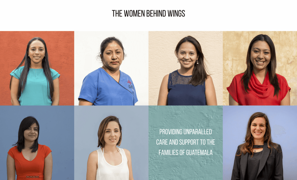
Drawing Inspiration from the Source
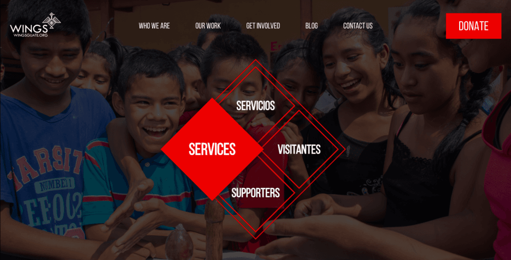
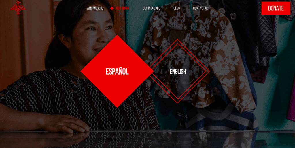
When our design team began putting together a new website for WINGS, we were immediately inspired by WINGS’ geometric logo, and ended up pulling the red diamond that’s used as the base of that logo and using it as a repeating design element throughout the site, repurposing it as the design in our secondary navigation. Since WINGS deals with healthcare, we wanted the aesthetic of the site to evoke a feeling of cleanliness and health, which is why we opted for a clean design that uses red as its primary color palette, a color that is easily associated with healthcare and medical resources.
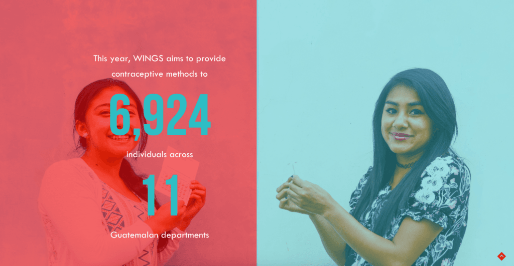
In order to fully utilize the amazing imagery that WINGS provided for us, we broke up sections of each page with their incredibly colorful and emotional photography, using full-bleed images as hero banners and backgrounds throughout the home page and interior pages. The site as a whole not only shows off their mission and impact, but paints an incredible picture of Guatemala’s unique culture and beautiful people.
Seamless Dual-Language Integration
Although WINGS is based in Guatemala and has a primarily Guatemalan staff, they serve and are supported by English speakers as well. The challenge of our design and development teams was to figure out an intuitive and seamless way to present their information in both English and Spanish. To do this, we again utilized the red diamond element to allow users to easily toggle between English and Spanish on pages that required duel languages. The English/Español subnav at the top of the page allows users to immediately select their language and see WINGS’ services, programs, hours, and events.
Interested in learning more about our website design & development process? We’d love to work with you in applying our conversion-centric design to nonprofit use cases. If you’d like to learn more, check out our nonprofit web-design agency, side • sea.