At ShareWell, play is so much more than idle time with toys — it’s an integral time when kids learn how to interact with the world, and through play, we can teach young minds about social justice, civic engagement, and culture.
Building ShareWell’s Brand

Building ShareWell’s Brand
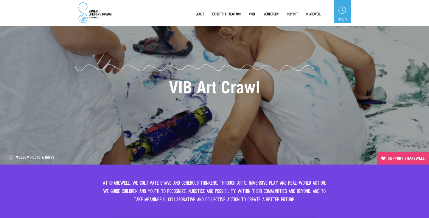
When ShareWell first approached Hopsie about designing their new website, there was some confusion and disconnect between brands and organizations. Formally called the Zimmer Children’s Museum, the organization was launching ShareWell as it’s new overarching brand, which included two main arms: programs for young children at the museum, and YouTHink, a program for adolescents and young teens. ShareWell wanted a new website that would introduce their new brand, distinguish between their two programs, and act as a gathering place to showcase news, events, classes, camps, exhibits, and more in an organized and easy-to-understand way. The website had to be designed so that it differentiated their two brands, but also unified The Zimmer Museum and YouTHink under one umbrella organization.
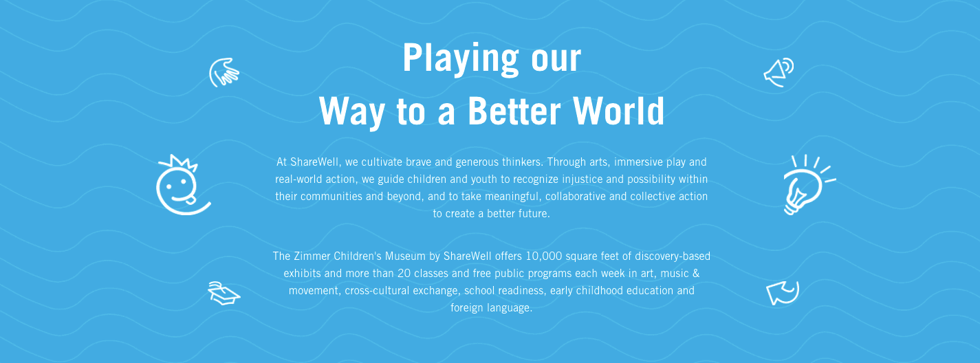
Because the ShareWell brand was new, another big part of the project was brand consultation. When the organization came to us, they had a color palette that they weren’t totally in love with and were looking for something that would be a reflection of their playful image. Our design team took a page out of ShareWell’s book and played around with different tones and combinations until we were able to achieve the palette ShareWell was looking for.
A Playful and Progressive Site
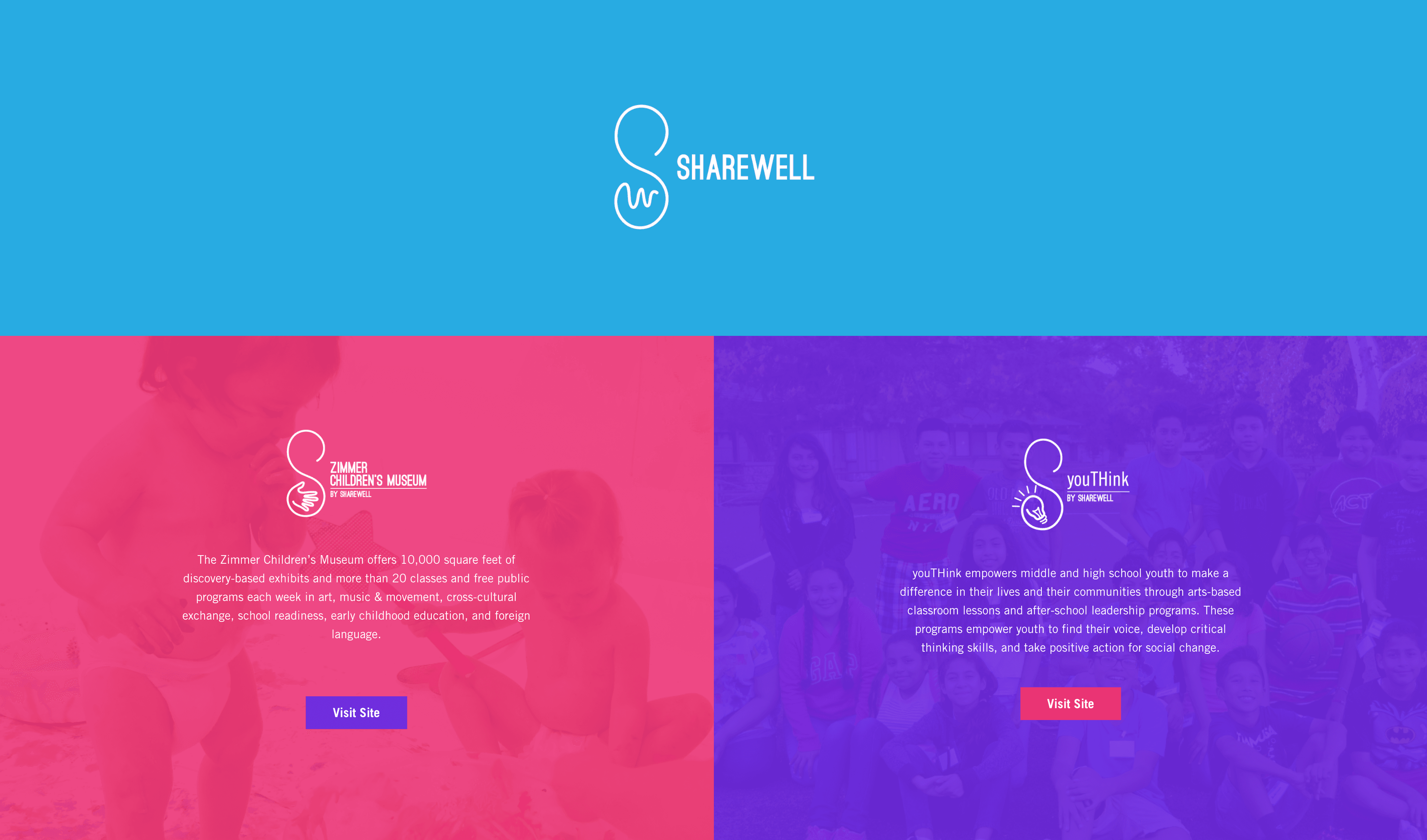
As we set to work on their website, first and foremost we wanted to ensure the visitors of ShareWell could easily get where they wanted to go. We created an initial landing page that asks users to choose between the children’s museum and a portal to the YouTHink site. Once inside the museum site, users can easily navigate between important museum information and featured programs and events. Because we wanted the site to be as image-driven as possible, we created an image mosaic on the homepage that acts as a secondary navigation system.
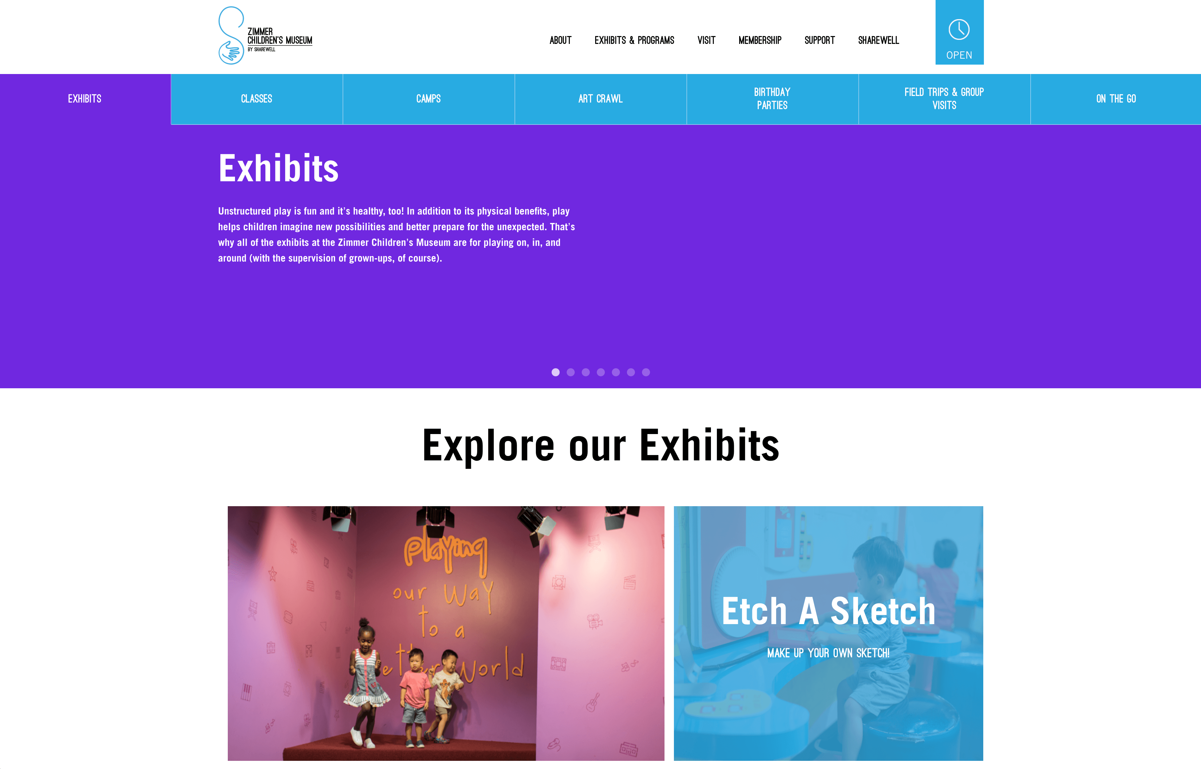
ShareWell’s programs and exhibits are the highlight of their organization, so we created a mosaic feature on that dedicated page that gives users an interactive way to engage with their different exhibits, while a tabbed system organizes their classes, camps, and other events. The colorful, playful, and energetic design reflects ShareWell’s strong brand, and makes clicking through their site as fun as the organization itself.
Interested in learning more about our website design & development process? We focus on beautiful, conversion-centric design to ensure your nonprofit is benefiting from its online presence. If you would like to learn more, check out our website services page.