What’s so special about the Allyson Whitney Foundation? Well, for starters, they’re heroically taking on a mission devoted to serving the needs of young adults with rare cancers — a demographic that’s historically underserved when it comes to cancer fundraising and awareness. But, even aside from the amazing work that they’re doing (and it’s a lot), what makes the Allyson Whitney Foundation so special is the passion, personality, and enthusiastic devotion that permeates throughout the entire organization.
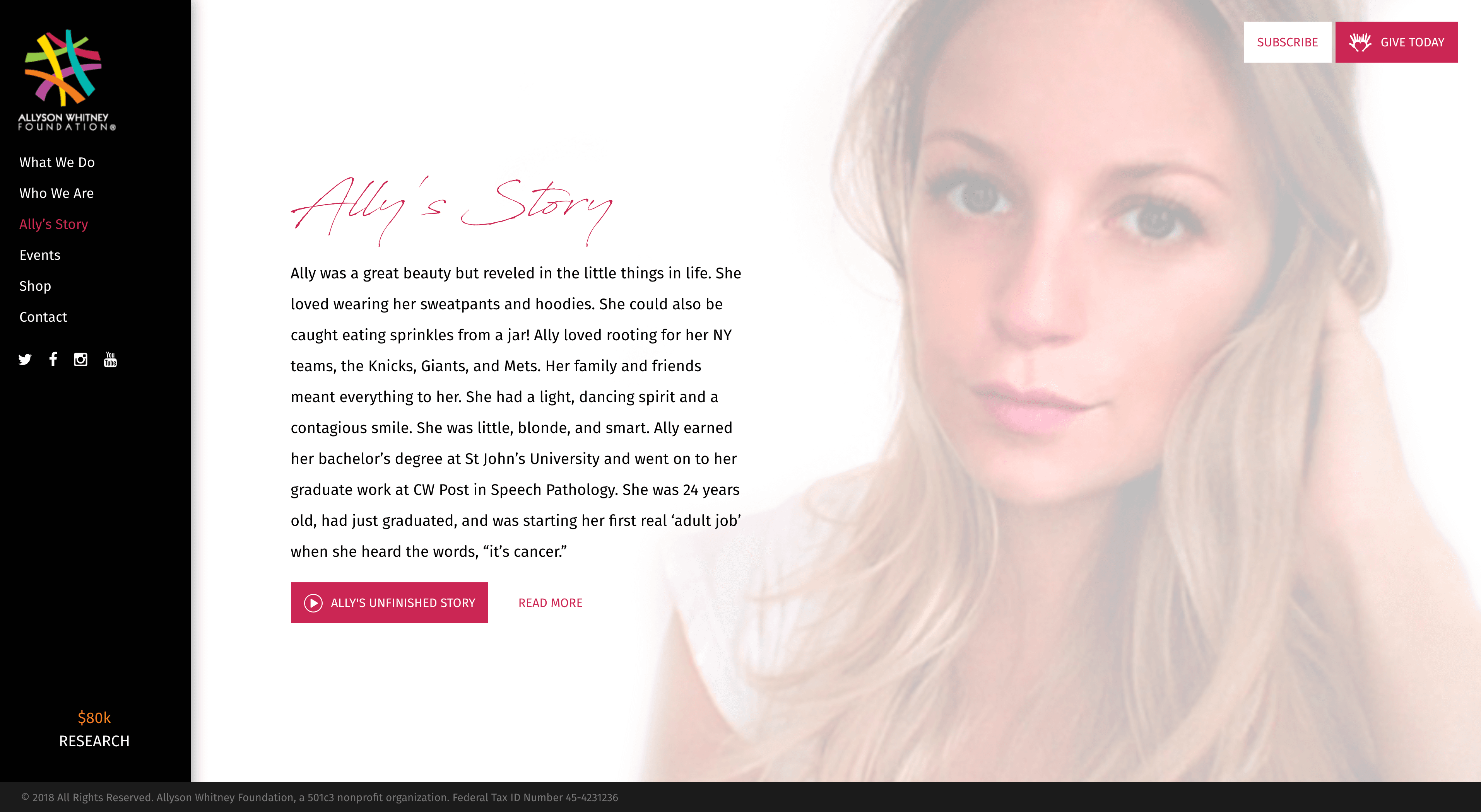
The Allyson Whitney Foundation is named for Allyson Whitney Strong, a young woman who passed away after a hard-fought battle with small cell cervical cancer. When her mother, Barbara, got in touch with Hopsie to redesign the AWF website, she had one clear direction in mind — she wanted the site to be a reflection of Ally. Ally was a fighter and cared deeply about others. After her cancer diagnosis, she made it her mission to help others in the same situation, whether it be financially, physically, or mentally. She was fun and light-hearted, but also wise beyond her years and deeply grateful for her life and the people in it.

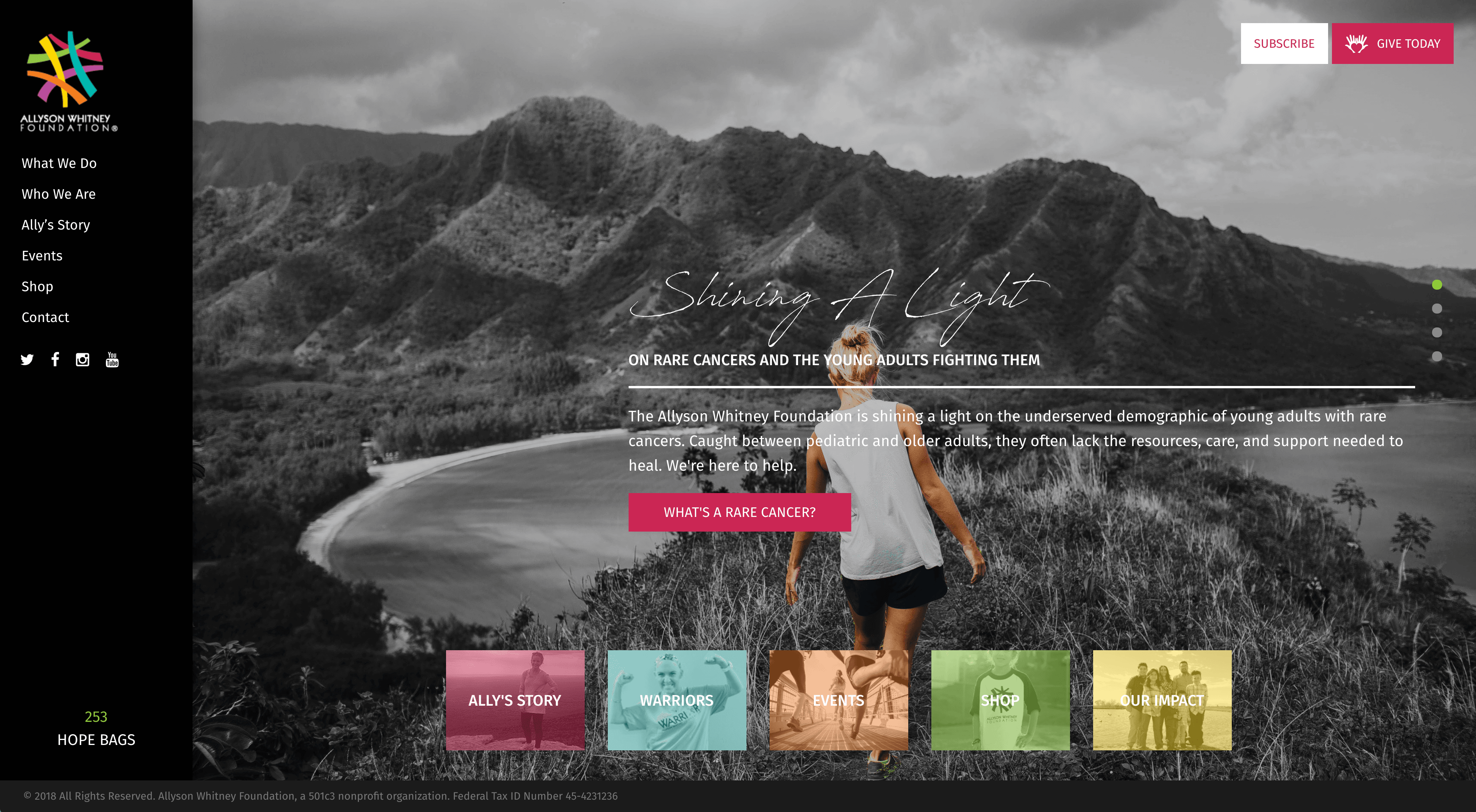
We set to work building a website that would encompass these special parts of Ally, while also increasing donations and gaining more visibility so that the foundation would be considered for increased corporate sponsorship and larger marathon races. We told Ally’s story through strong visuals and symbolism: the homepage design consists of full-bleed rotating images, each with a specific call to action that drive users to each of the main pages of the site. While the main background imagery is black and white, we put the focal subjects in full color to symbolize the color that Allyson Whitney and other cancer warriors bring to the world.

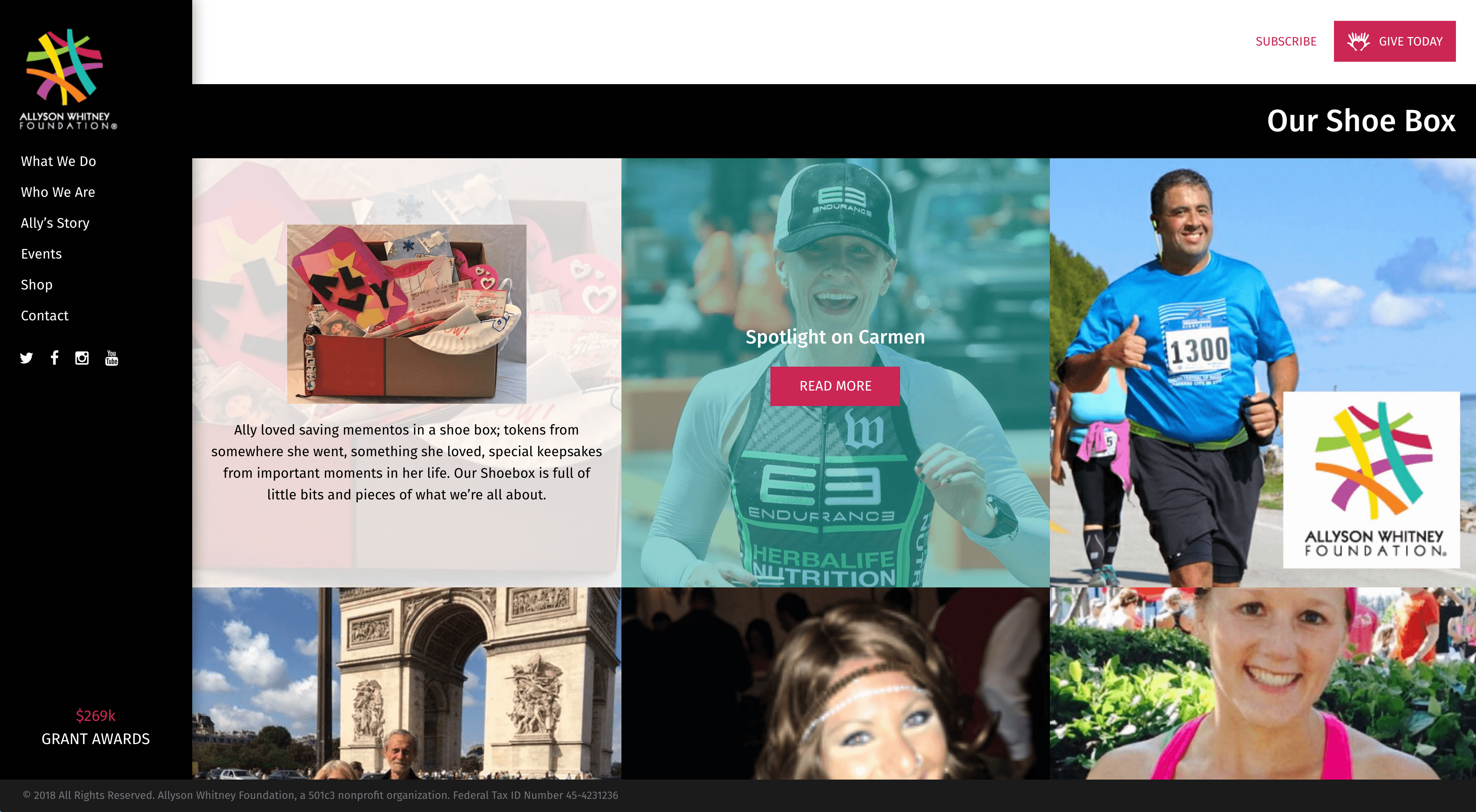
As another personal touch, we added a homepage section called “The Shoe Box” which pays homage to Ally’s habit of saving mementos in a shoe box. The site’s Shoe Box is a place to post inspiring and heartfelt reminders of what the Allyson Whitney Foundation is all about. The grid of images features pictures and excerpts that can be clicked into for full stories.

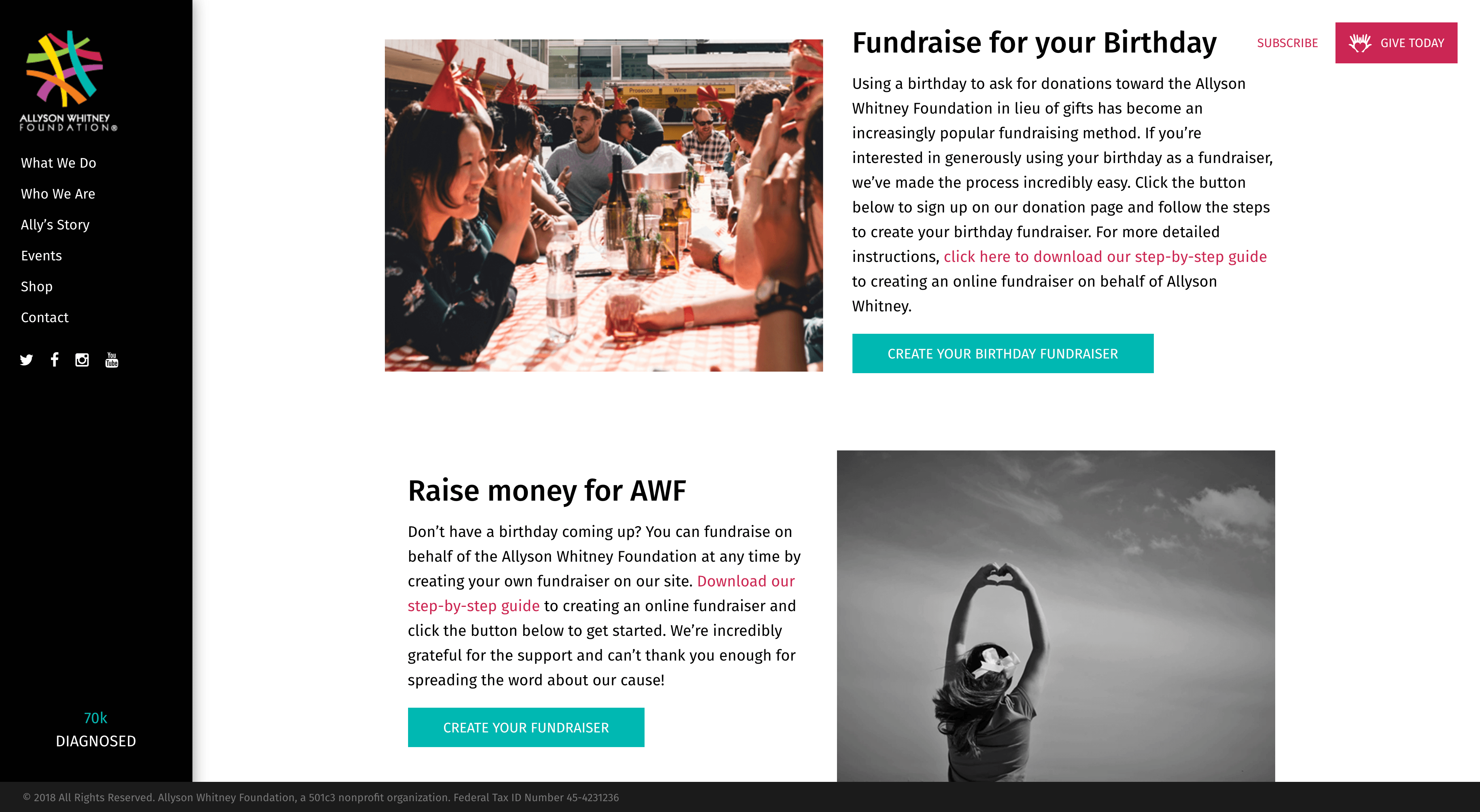
In order to increase donations, we implemented a robust Hopsie integration on the site. A donation form is integrated into the home page, and an interior page informs users how to give gifts in memory of someone, create your own fundraising event, and participate in peer-to-peer fundraising.

Throughout the entire process, we did our best to stay true to Ally’s vision and personality. Barbara, Ally’s mother, impressed us with her passion and hard work, and we wanted to give her a site that would carry on Ally’s legacy and achieve her mission of helping young adults with cancer.
“I can’t thank you enough for capturing my vision to honor my daughter and all the amazing people that have inspired us to continue (as crazy and hard as it is). I really feel confident now to put my foot forward to go after [the fundraising] to help many more.” -Barbara Strong Chief Executive Officer of the AWF and Ally’s mother.Interested in learning more about our Website design & development process? We are extremely excited to apply our conversion-centric design to nonprofit use cases. If you would like to learn more, check out our website services page.